Researching a similar band's marketing and star construction; Florence & The Machine
Researching Florence & The Machine's star construction and looking at the ways she's been marketed is going to be vital in understanding my target audience and hopefully will give me ideas and inspiration to reach out to that audience successfully. In terms of genre and image, Florence is similar to my group's band GLITTERKNIGHT so I think I can learn a lot from the promotional material, techniques, image construction and designs used here as we're both looking to reach a certain demographic, a certain audience, a certain fan-base.
I really enjoyed looking at the music video for 'Dog Days Are Over' and learned a lot from that in itself. Her image, solely from that music video, was constructed extremely well and represented her flawlessly. The star construction from that pop promo was clean, edgy, very indie and natural which I'm sure is what the marketing team behind Florence & TheMachine were trying to achieve.
The promotional material for Florence & The Machine's debut album entitled; 'Lungs' has to be one of the most well thought out, most cohesively themed marketing campaigns I've come across in my research on the subject. Similarly to the video for 'Cosmic Love', the visual elements to this marketing campaign have a very natural feel to them with an underlying darkness to the different aspects. This mix of contemporary edginess mixed with nature is something we've definitely thought of for our pop-promotion too.
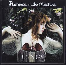
The lead singer Florence is at the forefront of all promotional material; especially on the album artwork and print advertisement. The prominence of this is that it really builds a visual for the voice that the audience hears and puts a face to the name, helping to construct a star image for the artist which is extremely important, as previously mentioned in my blog.
The costumes and props used in the album artwork and advertisement image are extremely elegant and a
re reminiscent of a very old fashioned, almost roman era. This classic element of the print ads in contrast with her very contemporary stage name (Florence and the Machine) create a lot of interest from the public
and help to draw in a curious audience.
Stylistically, the similarities between both promotional advertisement and the CD artwork start to create an extremely clear and concordant brand image for Florence and the Machine, making it extremely easy for audiences to work out that the promotional ad is linked to the album in question. The typefaces and logos are exactly the same in both too, just slightly differently positioned and sized though more information is rightly added to the print ad, letting the audience know about the different ways they can obtain the music and the product's release date which is extremely important in the music industry as the point in campaigns such as these are to sell as many products as possible in a short amount of time to gain chart positions.
Taking the marketing campaign to another level completely, the television spot/advertisement not only follows the style direction and theme of the album design but furthers it, animating the background and the darkness and wilderness of the nature that is portrayed on the graphics.
Building on a solid theme is absolutely crucial in a marketing campaign as this is the chance to put symbolism and ideologies behind the artist and create a star with unique qualities. Especially in this case, you're left rather mystified by Florence & The Machine as she looks quite innocent in the photographs with a darker side implied. This cleverness and concordance in the marketing for 'Lungs's is what makes artists stars, brands and id
entities and underpins the success of the album and it's sales.
Above are three images displaying promotional artwork for Florence & The Machine CDs. Despite the iTunes LIVE artwork, Florence & The Machine's artwork follows such a careful theme. The borders with the song title and Florence's logo can be seen throughout her entire discography and make these pieces of promotional material extremely recognisable to an audience. This is such a good example of branding and advertising done well. Even in the iTunes LIVE cover, another feature that Florence & The Machine uses throughout her marketing campaigns is that she uses screencaps from music videos as her artwork/promotional images. This is extremely smart. It builds a star image flawlessly whilst directly linking the promotional material to the music video so that fans that see either or first know straight away what is being advertised whilst maintaining a clear and cohesive design ethos.
This adds to Florence's star image - she represents herself as quite an indie, natural artist with very powerful music that speaks for itself. This is exactly the style, representation and star image that I'd like to build for our band GLITTERKNIGHT and looking into how Florence, a similar artist to our own band, has marketed and branded herself has been crucial to growing and creating an image for ourselves.
I feel like the idea to keep everything unmistakably thematic is key to star construction and the success of pop promos and promotional packages are largely down to that factor; being clear and consistent with promotional material.


No comments:
Post a Comment