 Artist: Britney Spears
Album: Circus
Label: Zomba Recording LLC, Jive.
Year: 2008
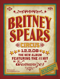
Britney Spears' Circus featured a forceful marketing campaign in 2008 as the comeback album from the once pop-princess. The theme of Circus was of course a circus theme as seen on every piece of promotional material. Left, you can see the press promotion for the album. Surprisingly, the most predominant feature, or lack, of is a picture of Britney Spears. This may be read that the fact her name is so large and the fact she's also a huge pop icon is that there's no need for a photograph; everybody knows who she is - especially after the traumatic break from her career which her label played on during the promotion for the album in a positive way. The album's print promotion feature's the artist name, the album name, date of release and states the fact the album features the high selling single Womanizer. Also
featured, is website details and a clever marketing technique; "Call Britney on the B line".

The album cover it's self is extremely similar in design with nearly exactly the same look and feel. Missing from the print ad, though is a photograph of the artist, Britney Spears which will jump out at potential buyers in a shop next to her name in large typeface. The colour scheme, layout and borders are virtually identical to the promotional poster for the album which will link the two to audiences stylistically.
The album, design-wise includes a variation of features to market it's self. The main focus is the photograph of Britney, staring directly at the consumer looking flirtatious, with pristine hair and make-up, in a Rodarte dress from the spring collection of that year. The way Britney is represented in this cover is completely positive - she looks confident, healthy, beautiful, in control and happy. A complete contrast to the connotations of her in previous years which is undoubtedly what the label and art directors intended. The colours used are very bright and pure; creams and light pinks. These colours have connotations of calmness - something also directionally intentional in terms of art direction and styling. It's very neutral, very clean and controlled - a representation trying to be portrayed about the artist at the time of release.
The comparison between the album promotional material is extremely similar, which is the case for most, if not all album promotional packages. The two feature coloured borders in colours that are often associated with circuses, the print promo also features a background that appears as slightly worn paper to give an almost vintage element to the promotion which is also vaguely featured thematically on the cover with the draped cream silk background and the very traditional hair, make-up and costume. The typeface throughout is also very circus themed with two particular concordant examples; the artist name/logo and the album name/logo. The link between the typefaces in the materials anchor the texts as promoting the same product as well as providing a clearly visible recognition of the product even though the typeface is slightly contorted on the album. The marketing team behind the promotional campaign know strongly that their market will recognise the branding.
The stars on both advertisment and album cover are similar, but not the same even though they follow the colour scheme of the promotion. This isn't a hugely important factor as the stars are there to reinforce the theme of the 'circus' and don't primarily market the album themselves. The theme of the circus, being the album title, has impressively large connotations too and is an extremely clever merchandising technique. Circuses are known, culturally, to be elaborately excessive performances of a colossal nature. Something magical, opposed to the norm and unexpected; exactly what the marketing team want the public to view the album as. Another connotation linked to the circus theme, is the link to Britney's life leading up to the release. If you're unaware, she faced a mental breakdown and public scrutiny during this as she faced psychiatric lockdown as well as addiction. 'Circus' is a reflection of this time too but carries a much more positive light as mentioned formerly; it's a reminiscent though tongue-in-cheek title for a hugely anticipated comeback album.
Overall, this is a perfect example of marketing and promotion leading up to an album release. The themes are flawlessly cohesive and really push the product as an identifiable brand. Something I've failed to mention is the corresponding music video also named Circus, which I will do a separate blog post on as there is too much to say. This too features and in my opinion, enhances and progresses everything which is displayed in this promotional package. I'll be referring back to this post to make comparisons between the music video and the rest of the promotional package, displayed above to fully justify the strength and success of this campaign. The album debuted in the top 10 chart in 23 countries; no. 1 in 6 of those.
No comments:
Post a Comment