Saturday, 27 November 2010

Primary Audience Research: Questionnaire

Thursday, 11 November 2010

Researching a similar band's marketing and star construction; Florence & The Machine


Researching Florence & The Machine's star construction and looking at the ways she's been marketed is going to be vital in understanding my target audience and hopefully will give me ideas and inspiration to reach out to that audience successfully. In terms of genre and image, Florence is similar to my group's band GLITTERKNIGHT so I think I can learn a lot from the promotional material, techniques, image construction and designs used here as we're both looking to reach a certain demographic, a certain audience, a certain fan-base.

I really enjoyed looking at the music video for 'Dog Days Are Over' and learned a lot from that in itself. Her image, solely from that music video, was constructed extremely well and represented her flawlessly. The star construction from that pop promo was clean, edgy, very indie and natural which I'm sure is what the marketing team behind Florence & TheMachine were trying to achieve.

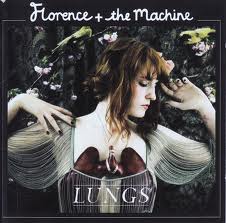
The promotional material for Florence & The Machine's debut album entitled; 'Lungs' has to be one of the most well thought out, most cohesively themed marketing campaigns I've come across in my research on the subject. Similarly to the video for 'Cosmic Love', the visual elements to this marketing campaign have a very natural feel to them with an underlying darkness to the different aspects. This mix of contemporary edginess mixed with nature is something we've definitely thought of for our pop-promotion too.

The lead singer Florence is at the forefront of all promotional material; especially on the album artwork and print advertisement. The prominence of this is that it really builds a visual for the voice that the audience hears and puts a face to the name, helping to construct a star image for the artist which is extremely important, as previously mentioned in my blog.


The costumes and props used in the album artwork and advertisement image are extremely elegant and a
re reminiscent of a very old fashioned, almost roman era. This classic element of the print ads in contrast with her very contemporary stage name (Florence and the Machine) create a lot of interest from the public
and help to draw in a curious audience.

Stylistically, the similarities between both promotional advertisement and the CD artwork start to create an extremely clear and concordant brand image for Florence and the Machine, making it extremely easy for audiences to work out that the promotional ad is linked to the album in question. The typefaces and logos are exactly the same in both too, just slightly differently positioned and sized though more information is rightly added to the print ad, letting the audience know about the different ways they can obtain the music and the product's release date which is extremely important in the music industry as the point in campaigns such as these are to sell as many products as possible in a short amount of time to gain chart positions.

Taking the marketing campaign to another level completely, the television spot/advertisement not only follows the style direction and theme of the album design but furthers it, animating the background and the darkness and wilderness of the nature that is portrayed on the graphics.

Building on a solid theme is absolutely crucial in a marketing campaign as this is the chance to put symbolism and ideologies behind the artist and create a star with unique qualities. Especially in this case, you're left rather mystified by Florence & The Machine as she looks quite innocent in the photographs with a darker side implied. This cleverness and concordance in the marketing for 'Lungs's is what makes artists stars, brands and id
entities and underpins the success of the album and it's sales.


Above are three images displaying promotional artwork for Florence & The Machine CDs. Despite the iTunes LIVE artwork, Florence & The Machine's artwork follows such a careful theme. The borders with the song title and Florence's logo can be seen throughout her entire discography and make these pieces of promotional material extremely recognisable to an audience. This is such a good example of branding and advertising done well. Even in the iTunes LIVE cover, another feature that Florence & The Machine uses throughout her marketing campaigns is that she uses screencaps from music videos as her artwork/promotional images. This is extremely smart. It builds a star image flawlessly whilst directly linking the promotional material to the music video so that fans that see either or first know straight away what is being advertised whilst maintaining a clear and cohesive design ethos.

This adds to Florence's star image - she represents herself as quite an indie, natural artist with very powerful music that speaks for itself. This is exactly the style, representation and star image that I'd like to build for our band GLITTERKNIGHT and looking into how Florence, a similar artist to our own band, has marketed and branded herself has been crucial to growing and creating an image for ourselves.

I feel like the idea to keep everything unmistakably thematic is key to star construction and the success of pop promos and promotional packages are largely down to that factor; being clear and consistent with promotional material.

By Ben Halliday

Thursday, 4 November 2010

Music Video Analysis: Florence and The Machine, Dog Days Are Over

Artist: Florence + The Machine
Title: Dog Days Are Over
Director: Legs

Florence's Dog Days Are Over initial music video relies heavily on Mise-En-Scene and is largely lead by narrative and concept. The factor that struck me first about this video is the production quality; the video has a dominantly 'home-made' amateur feel to it which I actually really like. This makes me, as the audience, feel like the artist is quite indie and very accessible and approachable; quite unique.

The video opens in a forest where we are introduced to the set, followed by a strange looking character what appears to be a wedding dress. As this shot progresses, we see Florence, the artist, lying down with a bottle in the forest. Once blindfolded, she is lead to the main location deeper in the forest. Here, the mise-en-scene is properly displayed. The extras in the video are extremely obscure in appearance with a heavily carnival theme regarding costume and make-up. Their mannerism leads us to believe they're quite tribal by the way they appear confused as they reluctantly peer around trees, catching a glimpse of Florence, surrounded by scattered carnival flags, ribbons and old fashioned bird cages, all draped from trees in the forest clearing. As florence pulls of her sequined blindfold, members of this circus-like tribe of all ages emerge slowly from trees and lanterns as a dramatic chase begins. Florence then trips and appears to be 'tribalised' by her chasers.

After, we see a dramatic increase in the slew of ribbons, fairy lights, glitter, colourful bold all-in-one costumes and over-the-top, teased hair and make-up. Now night-time, the following shot fades from black and shows a mid-shot of Florence; hair and face covered in golden glitter, heavily artistic make-up and carnival-themed clothing and a primal look on her face as the previous tribe begins dancing wildly as the music picks up again. We see extras splashing glitter over their faces and others', wild group dancing, angry expressions and overwhelming amounts of colour flashing before us.

This use of mise-en-scene gives a really creative visual to the song that audiences wouldn't otherwise associate with either the mood or lyrics. The heavy use of colour and props give audiences a welcoming, safe feel mixed with the obscurity and threatening behavior of the extras. The fact that the opening is the artist being woken up with a bottle in her hand leaves us with an unexplained stigma of why she was in a forest, why was she drinking and why is she alone? Above all though, who is this tribe?

In terms of cinematography, the hand-held feel gives the audience quite a uneasy view of the events which is intentional, particularly as the narrative unfolds. Close-ups are also shown to evoke question as these close-ups don't show us key images that we need to piece together the story, providing us with a really nice sense of ambiguity. Further into the promo, close-ups are used on characters faces, especially the artist herself to distinguish who they are and in terms of Florence, to build a star image and recognisable face to fans. A variation of angles are used throughout the piece and are rarely perfectly straight, again, giving us this lurking, onlooker feel which makes us feel rather unsafe but steadier shots are displayed towards the end where we are supposed to feel more secure which is expressed with the cinematography. I really like and appreciate how although the video is clearly not a large production with an endless budget that the simplicity of the cinematography can provoke so much emotion and feeling through basic though clever technique. This is the reason I chose this video to analyse because this is something that's important for me to explore and learn from when thinking about producing my own pop promo (music video). As well as the cinematography, there are a few good editing techniques that further the cinematographic brilliance. The mix of slow motion and fast cuts give a fast and slow pace at the same time which is hard to explain but goes excellently with the mood of the song and the narrative. In faster paced parts of the song, the mix of shots cut quickly provide the sense of confusedness and awe too which is important and I'm sure, by the look of it that colour enhancing has been used to give a cohesive quality to the video overall though this cannot be proved.

Furthermore, this relationship between the music and visuals is displayed through the artist miming the song frequently, dancing and the tribe playing basic instruments such as wooden blocks, bells and bits of nature! This again enhances the natural, quite primal theme of the video but also sets it apart from being an entirely narrative based video nicely, making us feel that the music is partially diegetic. As far as lyrics go, I don't think these are displayed effectively through visuals which is the negative about this video although I'm not sure this factor was important to the director. Loosely, the dominant theme of celebration throughout the video displays the lyrics "The dog days are over" which may reflect the end of complicated modern living which again is only speculation. Though saying this, I do think that more visual representation of lyrics in Dog Days would have seemed forced and taken many positive, clever elements of this video away.

The music video promotes Florence + The Machine quite well, as well as displaying characteristics of the musical style. It's evident through listening to her music that the sound is quite raw and natural, isn't heavily produced and is powerful yet calm. This is the image that is pushed to audiences about this artist and frankly, this video delivers it extremely well. Close-ups of Florence, as previously mentioned, build up a profile of the artist and ensure that the audience have a visual of her and the fact this video is filmed in a forest also connects extremely well to the album artwork where Florence is positioned before a similar setting which sub-consciously connects the video and album.

The audience for Florence + The Machine, from this video would on first thought be artistic types who appreciate the quality of the video and music. On further observation, the video can be viewed mindlessly by most. Adults will appreciate the music and image of Florence + The Machine, children will relate the video to circuses fantasy films and teenagers will both appreciate a mix of previous points but also aspire to her fashion. The video represents all ages, all sexes and all races and the diversity in this music video makes it appealing to all demographics.

CD Cover/Print Ad Package: Initial Ideas

The CD cover and magazine print advertisement package for our band need to have a cohesive design and similar colours/themes. I'd really like a clean approach to the promotional package as a whole using the same themes and colour schemes as we will use in the music video; golds, blacks and whites. The out-of-focus lights used in the video would be ideal background for the promotional package, fading to black at the bottom for the print ad where information will be. Examples/visual ideas shown below:


A clean,readable but modern typeface is also something I think if very important when representing ourselves not only as artists but also as a brand. It has to be something instantly recognisable to a customer but also stand out as something concordant to our look and feel. A few examples and ideas are shown below.


Finally, high quality photographs that will be placed onto the promotional package material will be needed. For this, we will use a digital SLR in a make-shift studio using basic three-point-lighting. As with the music video, the styling for the shoot will feature similar costumes and make-up (blacks, golds, whites etc) to really bring it all together as one cohesive package. This image will then be photoshopped to look natural but perfect. Photoshop will also allow us to control colours and lighting, we can add effects such as glowing, feathering and shadows and give the promotional packaging a professional feel.

"Lights" Initial Treatment

Mise-En-Scene:
My inner-synesthesic sees "Lights" as a very richly golden song in colour with darker and lighter tones to it so I really want to reflect this in the music video. Below are a few rough examples of the mise-en-scene and art direction I envision for our video.

Costumes and make-up:
- Black and white outfits with black/gold accessories.
- Reflective quality to clothing where possible (sequins, studs, embellishments)
- Unusual but on trend costume required to portray look and feel of artist/star construction.
- Strong smokey eye, nude lip w/ gold
accents re make-up. Powder for camera as usual.
Props:
- Glitter (Gold)
- Fairy Lights (Gold)
Location:
- Studio 1: Dark lighting w/ fairy lights (out of focus) as background.
- Studio 2: White backdrop, three point lighting.
- Landscape (Forest?)


Cinematography:
- Clean, smooth cinematography.
- A lot of CU's to show off artist/band.
- Good range of shots and angles.
- We will shoot the same thing multiple times at different angles/framing for easy editing.
- Open/Close promo slowly zooming into the artist/band.

Editing:
- The opening will feature fast cuts during the zoom timed with the pace of music.
- We plan to use these fast cuts again where appropriate
- Slow motion will be used - especially in shots during the verse and those shot outdoors.
- Colour correction and glow will be used to express colour/mood of song/video.
- For the narrative side of the video, continuity editing will be used.
- Smooth transitions regarding different angles/framing of the same shot.

Sound:
- To ensure perfectly synced audio, music will be used on-set and replaced during editing.
- As of now, we don't plan to add any diegetic sound.
- High quality version of the song will be placed as the primary sound.

"Lights" Initial Synopsis

"Lights" is essentially a song about security and power struggles so I think it's vital that these elements are expressed successfully in the pop-promotion for it. To open, the shot will be entirely out of focus but the subject (the artists) will become focused, leaving only the fairy lights against the darkness of the background unfocused as the camera zooms in slowly, cutting every now and then harshly to reflect the music. On the first line of the chorus, the subject will look up and begin 'singing' the first line. Here, different angles and shots will be cut using continuity with the pace of the song considered. The same cutting and general editing techniques will be used, switching to a white background and a lighter feel. ECU's of the eye will be featured here. In the chorus, the lights will flare (as the key word 'lights' is sung) as well as other key visuals such as 'doubling-up' the subjects on "You show the lights that stop me turn to stone/You shine it when I'm alone" - and as the last word "alone" is sung, the doubled image will quickly merge into a clear, singular, normal shot.

From here, outside shots will be used in the second chorus as well as cutting every now and then to the lighter studio scenes. The subject will be holding a handful of glitter which they will blow at the camera (slow motion will be used here) and 'singing' (miming) will be featured everywhere apart from this.

The same concept for the last chorus applies to this second chorus but this time with a larger variety of cuts, angles and framing. Eyes will be a key focus as well as a larger number of close-ups and more lighting flares. This will build drama and tension before the instrumental bridge. This will consist of the lighter studio shots fading in and out shots of running in the outside location along a path of glitter. The whole bridge will be in slow motion and as the bridge progresses, cuts between these two scenes will become faster until the end where, as the music drops, the shot will quickly fade to a lense flare (white).

Upon the last chorus and the ending, the darker studio with the out-of-focus fairy lights will re-appear, fading in from the intense white at the end of the bridge. Lighting will be key here as the drama is intended to be at the height of attention for this final chorus. Both I and Kira will be in shot together interacting as individual close-ups and mid-close-ups are shown of us individually.

In the instrumental closing, the pace will be extremely fast regarding cuts but will feature a very soft focus, fade between each shot. All three locations will be used during this and the end will feature a mid-close-up of feet running along the same glitter trail featured in the bridge. This will be the last shot and will fade into white.

Music Video Analysis: Starry Eyed, Ellie Goulding


As a very similar artist to my own band, I've decided that analysing Ellie Goulding's pop promo for 'Starry Eyed' would help me in defining this particular genre and learning about the star construction and codes and conventions of the indie/electro-pop genre.

The video is entirely conceptual, using two locations to express the look and feel of the song and artist. The pop promo is set in an elaborate mansion, almost fairy-tale-esque, furthering the image of the dream-like nature of the song in terms of lyrics and music. The second location is a dark studio where Ellie Goulding can be seen dancing, 'singing' and generally posing. There are some really interesting examples of mise-en-scene in the video that help promote Ellie Goulding and the lead song off her album; 'Starry Eyed'. Illustrating the lyrics, the video opens with blurry flashing blue stars which looks quite effective and sets the tone of the video, giving a subtle nod to the electronic qualities that the song possesses. This is furthered by the fact that Ellie has blue sequins in the shapes of stars stuck to her palms that she frequently flashes towards the camera, reflecting the studio lights which looks really effective. The costumes used in the video are quite typical of the electro-pop genre; Goulding wears a golden cocktail dress and heels and a black and white dotted t-shirt with a statement necklace combined with black jeans and oxford shoes. The latter is again an homage to Ellie Gouldings roots as a folk artist, bringing out the indie qualities in the song. There's also some interesting visuals in the music video such as the use of soft focus in the studio shots. Amongst the glowing blue stars mentioned before, the edges of the frame are blurred slightly, leading the eyes of the viewers to the centre- Ellie Goulding. There's a certain scene in the pop promo which is cut to regularly of Ellie laying on the floor, suddenly levitating whilst singing which is really effective as behind her is a blue toned light flaring into the camera, building a really nice silhouetted effect at times.

In terms of cinematography, to make for interesting viewing, the camera pans and zooms around shots, usually, but not always in time with the pace and beat of the song. This technique is furthered by using multiple angles of the same shot which are later edited together using continuity to make the audience feel like they're looking in at the artist from different aspects and positions. Though this range of angles is used throughout the song, the most prominent shot type is close-ups, making the audience familiar with the artist whilst asserting a star image for Ellie Goulding, which, as her first pop promo is important for the star construction and growing her fan-base. The editing for this music video is really the key factor for the definition of tone and pace. Following the beat of the song, cuts are made appropriately and the shot length is kept short which compliments the characteristics of the genre style shown with
the costumes, colours and locations. There are also two dancers/acrobats in the mansion which have been edited beautifully, creating a motion trail behind them (this technique is also used
on Ellie Goulding's hands at times in the pop promo). This effect is illustrated to the right.

This pop promo defines and promotes the image and style of Ellie Goulding well whilst constructing a unique star image through the use of close-ups, costumes, locations and props. Ellie Goulding is represented as an energetic, young female artist with a certain innocence to her which is signified by her wide smile, coy body language, minimal make-up and long blonde hair.

From this innocence and the nature of Ellie Goulding's simplistic visual approach to the genre, her audience is likely to be young females of an age range 15-25. Being a young, pretty female though there is of course an opportunity for the marketing towards males and the male gaze and the non-gender specific following of genres such as indie and electronic music make this hybrid of those genres a really wide-audience potential video which is, I think what has been achieved here. The energetic nature of the video, paired with the fun dancing and playful imagery in the pop promo enforce this very young representation and audience attraction to the branding of Ellie Goulding and I think it fits her, the song and her image well.